Colouring Maps
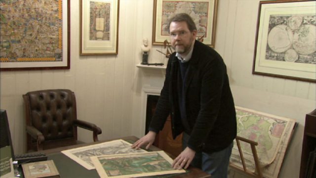
A short clip that explores the cost benefit of colouring maps.
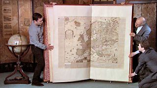
Denis Lawson explains how the mapmakers discovered that the simple act of colouring made a map more desirable and profitable.
Documentary series charting the visual appeal and historical meaning of maps.
The British Library is home to a staggering 4.5 million maps, most of which remain hidden away in its colossal basement, and the programme delves behind the scenes to explore some amazing treasures in more detail. This is the story of three maps, three visions of London over three centuries; visions of beauty that celebrate but also distort the truth. It's the story of how urban maps try to impose order on chaos.
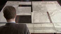
On Sunday 2 September 1660, the Great Fire of London began reducing most of the city to ashes, and among the huge losses were many maps of the city itself. The Morgan Map of 1682 was the first to show the whole of the City of London after the fire. Consisting of sixteen separate sheets, measuring eight feet by five feet, it took six years to complete. Morgan's beautiful map symbolised the hoped-for ideal city.
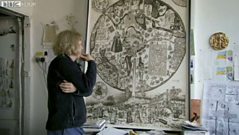
In 1746 John Rocque produced at the time the most detailed map ever made of London. Like Morgan's, Rocque's map is all neo-Classical beauty and clinical precision, but the London it represented had become the opposite. In engravings of the time, such as Night, the artist William Hogarth shows a city boiling with vice and corruption. Stephen Walter's contemporary image, The Island, plays with notions of cartographic order and respectability. His extraordinary London map looks at first glance to be just as precise and ordered as his hero Rocque's but, looking closer, it includes 21st century markings such as favourite kebab vans and sites of personal heartbreak.
Duration:
This clip is from
More clips from City Maps - Order out of Chaos
-
![]()
William Morgan's Map of London 1682
Duration: 05:16
More clips from The Beauty of Maps
-
![]()
Klencke Atlas 1660—Atlas Maps - Thinking Big
Duration: 03:08
