Orientation
Orientation refers to the direction of lines. They could be vertical, horizontal or diagonal.
Lines can be used in art and design to help guide your eye around a painting, or to create a sense of balance and structure. Deliberate use of horizontal, vertical and diagonal lines can help to create a focal point. They can also help to suggest depth and a sense of perspective.
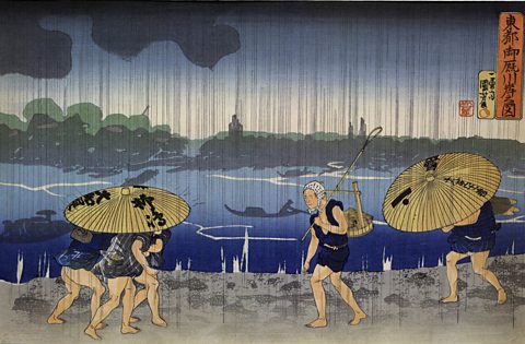
Shower on the Bank of the Sumida River at Ommaya Embankment in Edo (Utagawa Kuniyoshi, 1834) has vertical lines that direct the viewer’s eye down to the people walking by the river.
The horizontal lines of the bank itself also adds to the sense of movement, leading our eyes back and forward between the people rushing along under umbrellas.
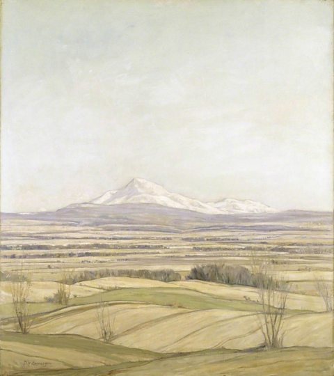
The horizontal lines in Ben Ledi, Early Spring (Sir David Young Cameron, 1914) create a sense of rest and space.
They suggest a flat landscape stretching out beyond the frame.
These calm lines help emphasise the mountain that rises behind them in the distance.

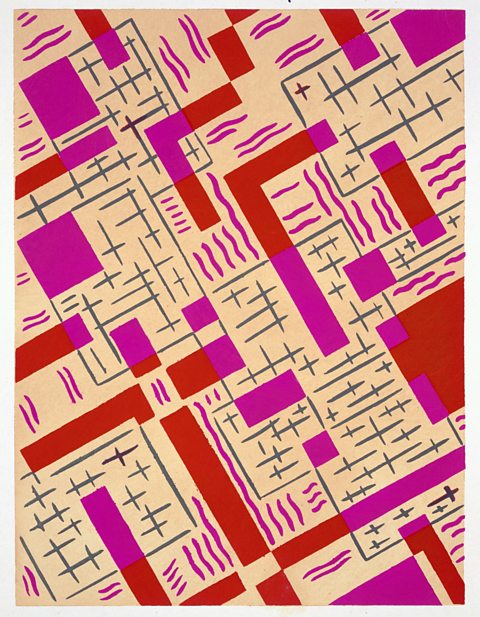
This print design from Nouvelles Compositions Decoratives by Serge Gladky (c.1920s) is entirely made up of diagonal lines and shapes.
The diagonals lead in different directions and there is no focus for the viewer’s eye to rest on.
This shows how diagonal lines can be used to create a sense of movement, energy or even uneasiness.


Lines are often used in design for decoration, or to imply structure and strength.
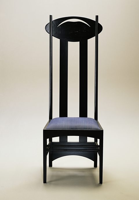
This high back Argyle Chair (Charles Rennie Mackintosh, 1903-1905) has short horizontal lines and two thick vertical lines that make the chair appear strong and sturdy.
The thinner lines at either side of the back add a feeling of lightness and elegance.
