Imbalance
Sometimes artists and designers will deliberately create a sense of imbalance in their work. This can be used to create a sense of unease or even danger.

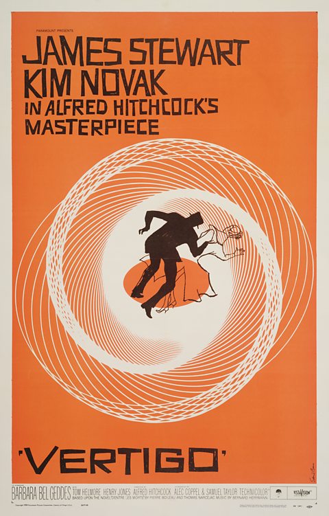
Saul Bass's poster for the 1958 film Vertigo mixes balance and imbalance.
The overall composition is asymmetrical. The main spiral shape is centrally positioned and its visual weight is evenly spread. The two figures are offset to the right of centre but they are balanced by the text on the left of frame.
Radial balance is created by the central spiral. It radiates from the centre of the composition and its visual weight is evenly spread.
Imbalance is created by the position and pose of the figures. The eye is drawn upwards from the centre of the spiral along the male figure's legs, up and to the right by the angle of his torso and then further to the right along the female figure to her head and hand. The shape of the spiral behind them also draws the eye in this direction.
This central, imbalanced image creates a sense of tension and unease that reflects the mood and themes of the film.
