Overview
Unlike adults, children do not go online searching for the most efficient way to compare and buy car insurance. Children are more interested in finding out about their favourite cartoon character, playing games, or getting help with their homework. To the adult world, children's motives may not seem useful, methodical or even logical. Ultimately, whatever reason kids have for being on the internet boils down to them seeking to use and reuse quality content - just like adults. They're driven by the same primary goals.
Quality content is one part of the battle. Making content accessible to this audience is another. Some children have not yet learned to read and having low motor function makes way-finding and interaction tricky. Therefore, it makes sense to think about designing for children in a different way to adults. However, many of the qualities that make it easier for children to use websites can also pay dividends for an adult audience.
Over the last few months, we have carried out extensive research into our younger audience and how we design for them. This article seeks to briefly present some findings and tools that we have created to aid you in designing for this audience.
Understanding our audience
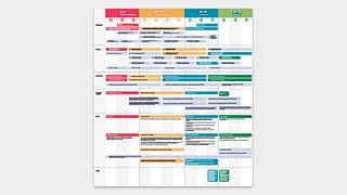
Understanding a new audience group can be overwhelming at first. We've put together a toolkit to help get you started.
These are our users…
This toolkit reminds us of the key differences between different age groups: how they browse, what devices they're familiar with as well as their reading level. At every stage of the design process, we keep these in mind.

Note:
Whilst our research looks at children of all ages, we have seen that from the age of 12 children have the experience and ability to interact with digital experiences in much the same way an adult would. We have therefore focussed on providing useful guidance and examples based on ages 12 and below.
Our 7 design pillars
From our research, we created these pillars for designers to consider when working on experiences for kids.
1. Give positive feedback and create moments of joy
Recognise and celebrate effort and achievements to help build a growth mindset. Create joyful experiences where it's okay to make mistakes without feeling punished or confused.
Karate cats on łÉČËÂŰĚł Bitesize, uses interstitial animations to reward users for answering correctly. Children also see an animation when they get a question wrong, but we design them to encourage - not demoralise.
2. Be visual, reduce text
Be bold. Be simple. Keep words to a minimum and support them with visuals and iconography.
Phase 3 phonics on łÉČËÂŰĚł Bitesize shows minimal text and always has an audio alternative available. Where we can, we substitute text for iconography, too.
3. Make the goal immediately clear
Show them where they are. Tell them what to do next. Children want instant gratification and don't want to wait.
My world kitchen on CBeebies uses audio guidance paired with animation to make interaction and the goal of the experience clear.
4. Be Heard
Audio adds meaning to UI elements and content. It's a powerful tool which enriches the experience and aids accessibility.
From button presses to download complete sounds, The CBeebies playtime island app is enriched by its use of audio. These sounds are fun but also assure children that something is happening as a result of their input
5. Animate with personality
Bring your experience to life. Use animation to entertain and reward.
The Hey Duggee paddling badge game on CBeebies is brimming with exciting animated elements.
6. Craft a character led experience
Children love characters. Think about putting one at the heart of the experience
The iPlayer Kids TV app has created a character first navigation. Whilst children may not be able to read at this age, they can recognise their favourite CBeebies and CłÉČËÂŰĚł characters meaning content is easily accessible.
7. Forgiving design
Children's fine motor skills vary as they develop. Ensure interactions are forgiving, remove the potential for a child to become frustrated with unintended actions or mistakes.
Jigsaw puzzles on CłÉČËÂŰĚł have a snapping function creating affordance for lack of motor skills at young ages.
Conclusion
This article has all been informed by our extensive research with our younger audiences. As children and technology are constantly changing, the content inside this article is likely to grow and evolve. We need to carry on researching and learning about how kids use websites, apps and devices, so we can keep designing in helpful ways.
We hope you've found this article useful and these resources help you to create online experiences worthy of the next generation of internet users.
This research is the evolution of an article published on 18 Aug 2016 under the same title. This content is now archived. The archived document is available here for context.


