Legibility
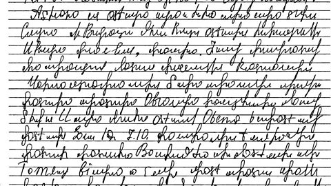
If text is legible, it means that it is clear enough to read. When it is not readable it is called illegible.
Legibility with colour and contrast
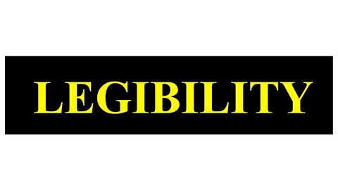
Using contrasting colours against another colour is a good way to achieve a striking design.
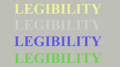
Adjusting the colour of the background and the font, can alter how legible the text is.
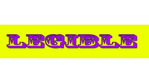
The colour inside part of the letter is the same as the background colour and this causes the eye confusion.
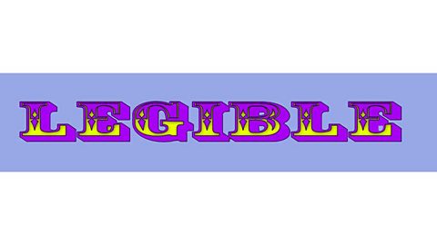
A slight adjustment to the background colour can make all the different, making the somewhat illegible font appear more legible.
Legibility with font
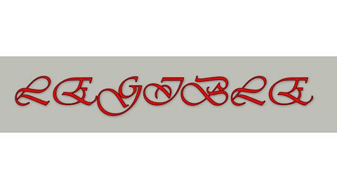
The choice of typeface can play a large part in the legibility of a word. In this example, the colour choice is good because the red stands out very well against the grey background. However, this typeface, which is a script style containing swashes and flourishes, is illegible because the letters are upper case.
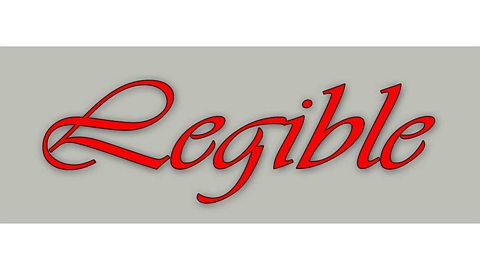
When lowercase letters are used, although the тАШLтАЩ at the start of the word is still not the clearest because it is overly decorative, it is legible as a whole.

Use of a sans-serif font makes the word very legible. The deep blue colour on top of the paler turquoise background is a combination that is pleasing to the eye. The two colours in the lettering combine well.